
Lightship / 8th Wall GSB 2.0 workflow design
2023 10 - 2024 06 / Role: UX designer, UX researcher
Team: ARUX - Alesha Unpingco, Ian Heisters, Emma Mcmillin, Heather Hyerin Im, Rachel Kreutzkamp
BACKGROUND & GOALS
Today developers building games with VPS aren’t able to filter or choose the most relevant locations for their applications. For example, a developer trying to build a procedural world-scale experience can only filter on good or fair quality VPS locations today. This is unacceptable because developers aren’t able to filter for relevant locations at scale which is a hurdle they can’t overcome without the Lightship/8th wall platform.
We envision a world where developers can easily inspect, filter and add relevant AR locations to their applications.
LIGHTWEIGHT USER RESEARCH


Search & Filtering
Developers find it difficult to quickly discover and add suitable locations due to limited filtering options and scalability.

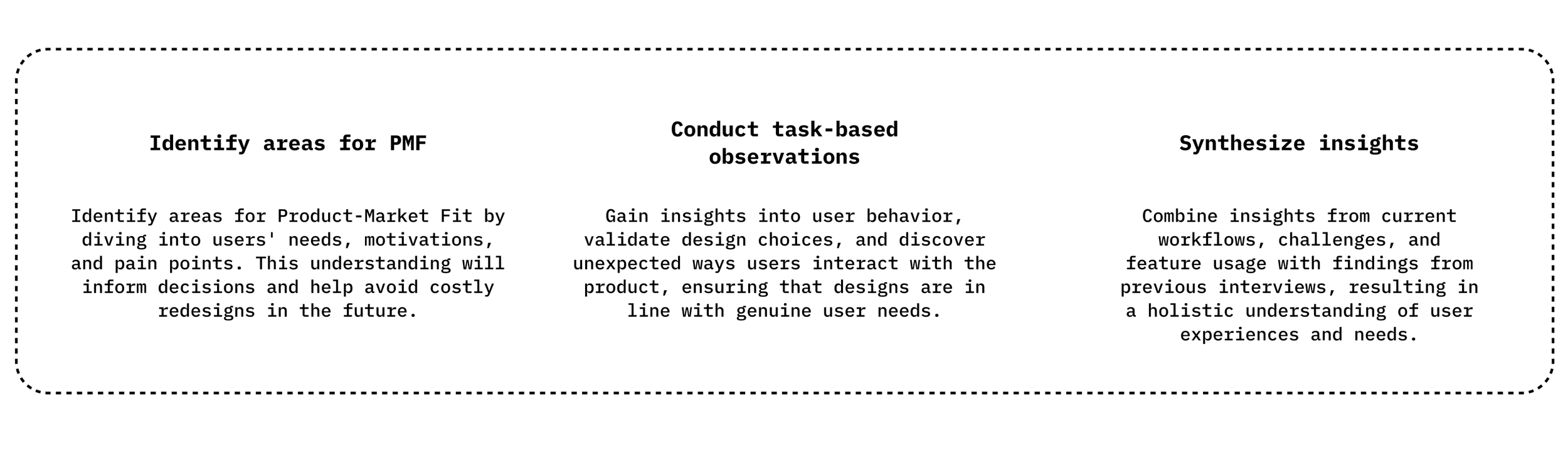
As a UX researcher, I conducted lightweight user research with internal Niantic colleagues to better understand user behavior on location management and GSB use. I completed 9 interviews with internal users (game team creatives and engineers, ARUX designers/engineers, and developer support engineers). The 3 objectives of the study were: 1) Identify areas for PMF, 2) Conduct task-based observations, and 3) Synthesize insights.

The user journey map was divided into three steps: starting with the ‘Discover’ step, where the developer looks for a Wayspot for the AR experience of the content; ‘Evaluate,’ where the developer assesses whether the location is suitable; and finally, ‘Learn,’ where the developer gathers more information about the location.

Based on the user study results, we categorized the key insights according to the user journey map, aligning them with the study objectives.
DISCOVER
Map Interface Confusion: Many users actively used quality and location type filters but rarely used the grid button for location categories. Symbols, pin colors, VPS quality buttons, and gray blobs on the map caused confusion about the locations.
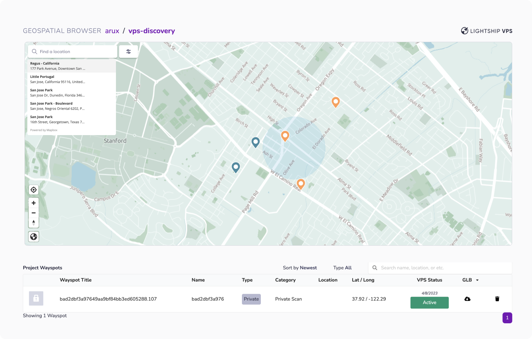
User Search Behavior: Users often searched by place names, addresses, types (e.g., park), or specific names (e.g., Gandhi statue), sometimes copying addresses from Google Maps. Some desired filters for specific location attributes, but these were unavailable.
EVALUATE
Lack of Location Info: Users wanted more details about areas around locations, as the provided mesh was insufficient. They sought info on space, walkability, accessibility, cultural significance, and sightlines, often turning to Google Earth’s Street View. Most also evaluated VPS status, mesh quality, and size.
Evaluation Criteria: Users prioritized safety, brightness, welcoming atmosphere, mesh quality, and popularity. They also suggested adding data on foot traffic, sound levels, building heights, and historical points of interest.
Based on the user study results and the team’s PRD, we focused on three areas to improve the current GSB

To validate the first hypothesis on filter panel design, we prioritized organizing key information into three categories: (1) playable area, (2) location category, and (3) location types. Initially, we used simple icons (e.g., human figures, trees, buildings) and colored grids to visualize space size. However, this approach faced scalability issues with proportional representations and struggled to include details on both area size and quantity effectively.

LEARN
Interest in Additional Info: Users sought more details on landmarks and art after reviewing geographic data and mesh details, often considering site visits or using APIs like Overpass.
Changes or Issues: Users were often unaware of location changes (e.g., a new mural or missing statue) due to lack of support, relying on personal observation or user feedback.
Organizing Wayspot List: Participants found numeric codes confusing and wanted thumbnails for easier organization.
PROBLEM
Lack of information
Developers lack tools to easily identify meshes with sufficient dimensions for their AR experiences, making it challenging to find large enough play areas or understand mesh coverage in square meters.

Mesh view options
When developers first click on a wayspot, they want to initially see the best-combined meshes. However, they should also have the option to view other individual meshes if needed.
SEARCH & FILTERING / LACK OF INFORMATION
PROBLEM DEFINITION
The issue we identified with the current GSB is that the search bar’s functionality is limited. The filtering features are also restricted to filtering VPS quality located on the left and categorizing locations, but even these functions fail to convey information clearly. Additionally, the placement of buttons and the roles of location pins contribute to confusion within the map interface. As a result, many developers experience usability limitations.

To effectively convey both the quantity and size of locations, we opted for a slider option and integrated the location’s color chip directly into the button for better visibility. Additionally, to address the UX writing limitations highlighted in previous research, we categorized spaces into “objects” and “categories” and improved the representation of VPS quality with an intuitive label, “Status.”
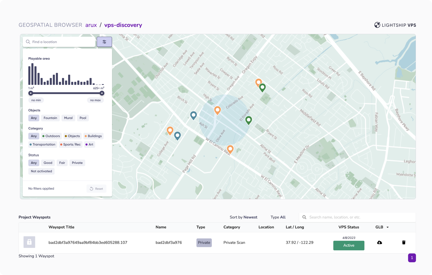
FINAL DESIGN: SEARCH & FILTERING / LACK OF INFORMATION
Additional Notes
Clicking on the search bar or the filter button will also deselect the current pin and close both the location card and mesh viewer panel.
Clicking anywhere on the map (other than another pin) will close both of these and deselect the selected pin. (As a quick way for the user to be able to navigate the full map).
Additional Notes
Clicking the search bar will close the filter tray and open the search bar dropdown
MESH VIEW OPTIONS
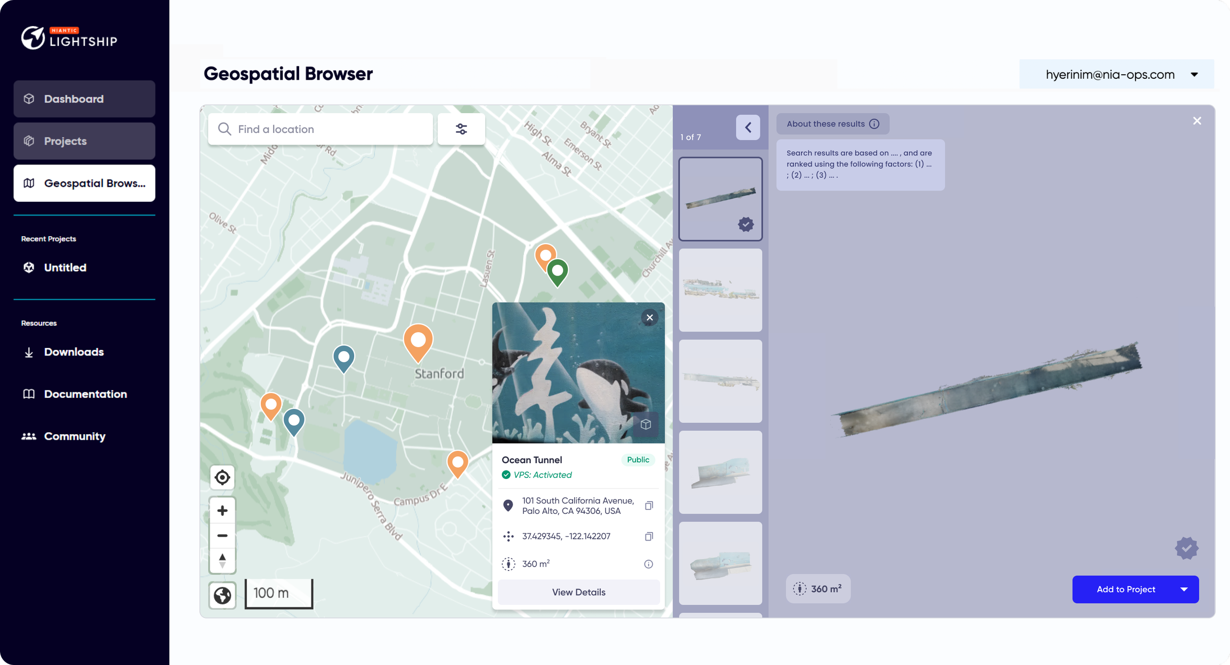
PROBLEM DEFINITION
The issue we identified with the current GSB’s mesh view option is that there is no way to determine the recommended mesh when multiple meshes are provided for a single Wayspot. Additionally, there is no way to view non-recommended options collectively. This creates inconvenience for developers during the process of reviewing meshes. Moreover, the current location card lacks sufficient information and suffers from poor space utilization, further limiting its usability.

To design a mesh thumbnail list that highlights the recommended mesh while also displaying other meshes simultaneously, we explored several design options, ultimately selecting the one that maximized space efficiency. Beyond simply displaying the recommended mesh, we iterated on ways to incorporate additional necessary information within the available space.
For instance, we considered features like the next step in the user flow, such as “Add to Project,” details about the playable area for each mesh, and what information should remain visible on the map when the mesh is closed. Our design approach focused on enhancing the extensibility of the user flow to ensure a seamless and intuitive experience.
LOCATION CARD
The original location card had several areas that required improvement in terms of space utilization for information. To achieve a better balance of information, we redesigned the location card by adjusting the placement of images, the amount of information displayed, and the use of UI elements. The newly designed location card received significantly better feedback internally, particularly in terms of readability and the amount of information provided.


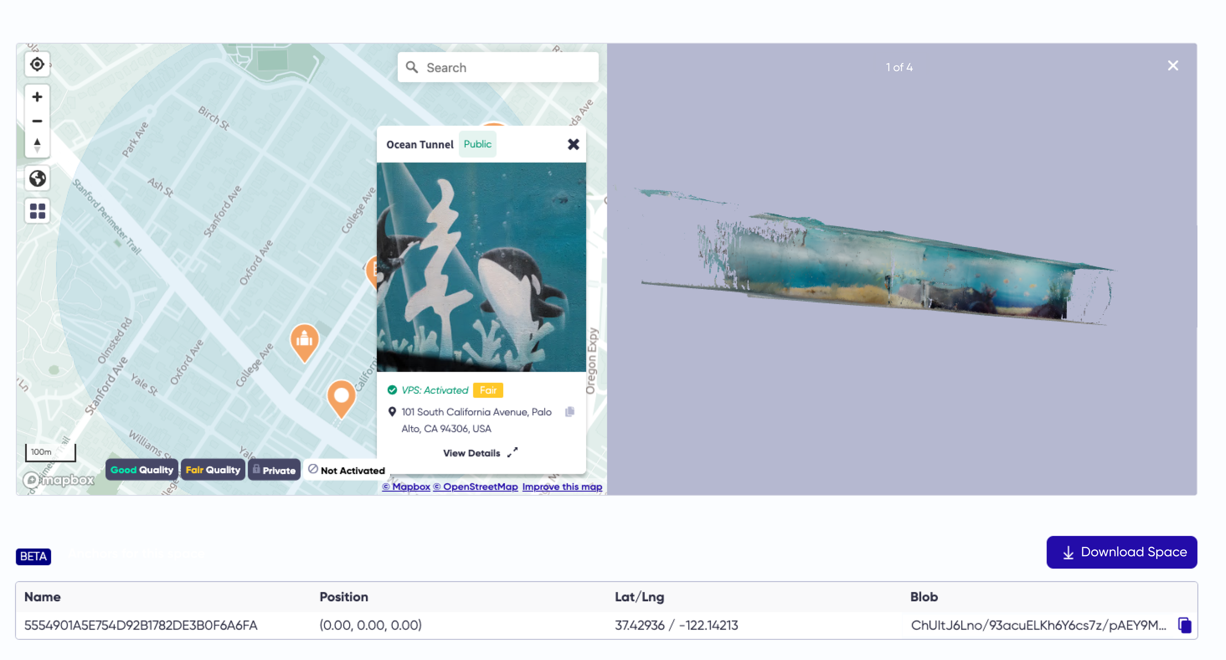
Before (left), After (right)
USER JOURNEY MAP
Based on the task-based observation sessions, I designed a user journey map that focuses on the user’s purpose (e.g., “As a developer, I want to…”), along with their thoughts, actions, notes, touchpoints, and emotions.
This approach was aimed at better understanding pain points and uncovering valuable insights.

